Your resume needs some love…
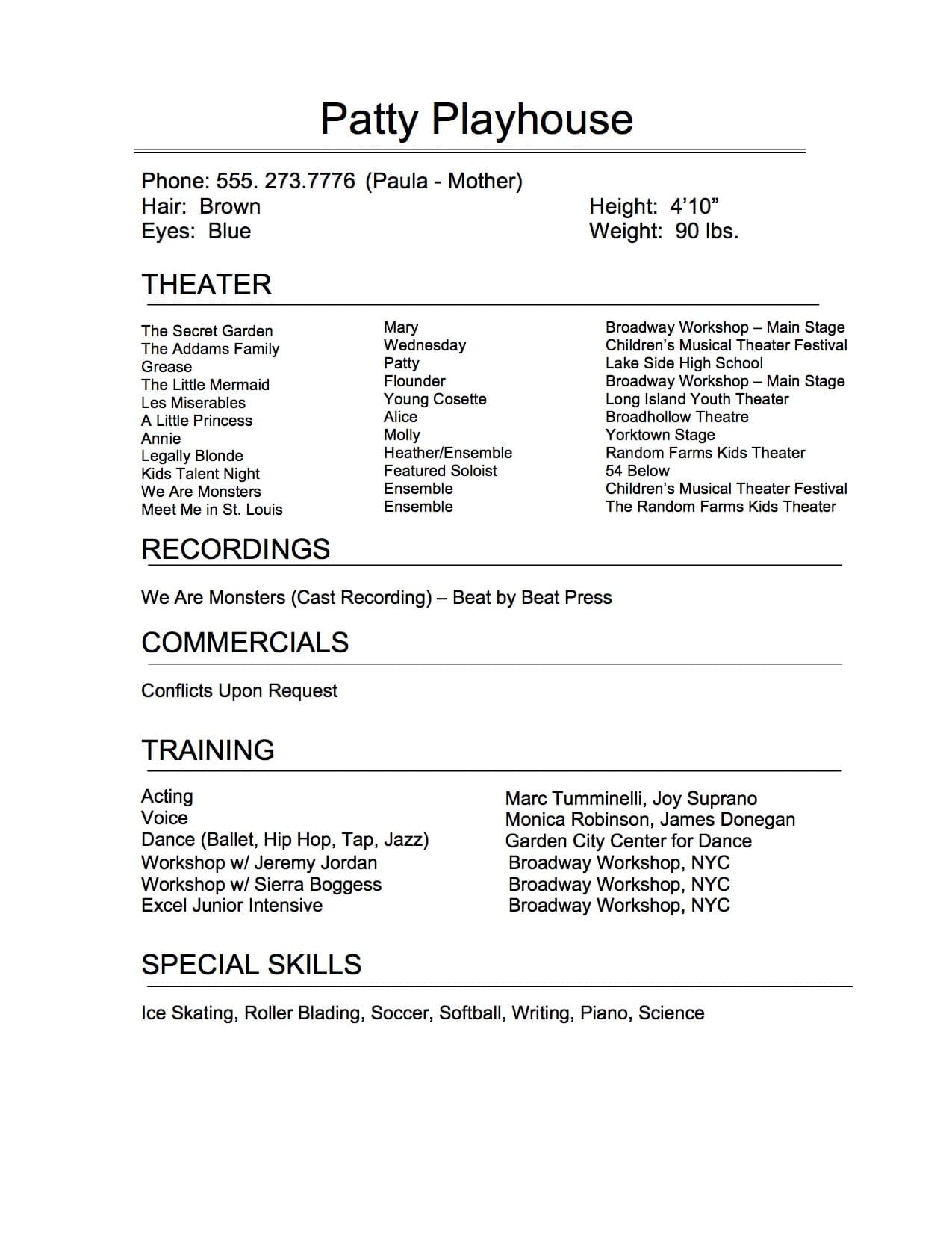
It’s pretty weird for a kid to have a resume but in this business, you need one. The format for a theatrical resume is not like a professional non-theatrical resume. I’ve seen so many resumes from kids and teens that are pretty much a hot mess so I hope this helps. Below are some tips to make sure your resume looks as good as you! I have also included a sample resume for you to use.
- Make sure your resume is clean and easy to read!
- You should have a list format – the name of the show (CAPS), role you played, theater or company that produced that show. Do not use full sentences.
- Make sure that your contact information is current and correct. If no one can reach you, then it’s all kind of pointless, isn’t it?
- Less is more. You should list the credits you are most proud of first (especially if you have a lot of credits). The Middle School Christmas concert is not really necessary. When listing education, you do not need to list every workshop or class you’ve ever taken. And if you’ve been in 60 musicals, maybe list 10-15 of those projects. Keep it current!
- Your resume should be printed on 8 x 10 paper and fit perfectly on the back of your 8 x 10 headshot. Normally, paper is 8.5 x 11. If you are going to print on 8.5 x 11 paper, then you will need to cut it down to the right size. It’s a real pain, so why not just buy 8 x 10 paper.
- Your resume should ONLY be 1 page.
- Do not add reviews or extra attachments to your resume. It just makes it look messy (and a little desperate).
- Do not use those plastic sheets on your headshot/resume. Save them for your music book.
- Do not put your address on your resume. You never know where these things end up and the last thing anyone needs is a photo of you and your home address attached to it.
- Make sure you have the correct spelling of any teachers or directors you have worked with. I have seen my name spelled in insane ways on resumes. It makes me crazy.
- Make sure the type point is at least 10 point. If you need to reduce it to less than that, you have too many things on your resume. Avoid using multiple fonts – don’t use more than 2 different fonts.
- When you create your special skills list, make sure you can do those actual skills at any moment. If you need a half hour to warm up to do your duck impression, maybe it’s not that special. Only add acrobatics if you can do a back handspring or better. A cartwheel is not actually acrobatics. It’s a cartwheel.
- Try to avoid embellishments on your resume. Industry professionals who are looking at your headshot and resume know that you are a young performer and they appreciate whatever you have on your resume. Be proud of your credits and avoid trying to make anything sound fancier than it actually is.
- Commercials are often listed as Conflicts Available Upon Request. That basically that means if you have a deal with Coke, you can’t have a deal with Pepsi. If you don’t have any deals or you are not really auditioning for commercials then you can just remove that section.
I hope you have found this helpful. Take a look at the resume templet below and use it. I hope this has helped a bit as you put together your winning resume. Next week I’ll talk more about your headshots so stay tuned.

MARC TUMMINELLI – Broadway Workshop 10/27/17
